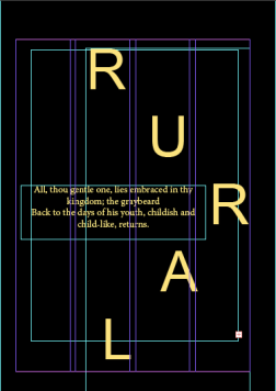
Typeface and Colours

I decided that i would go for a simple text, so i went for minion pro because it is easy to read and it looks best with all of my images. I think it looks best for the theme of my project.

Screen Shot 2018-03-15 at 19.54.31

For my images and magazine, I’ve decided to change eventing into black and white but to keep the road signs in colour because it give it that little bit of colour and impact that I wanted for my magazine. The screenshots below are examples of the images that I will use in my magazine, I think with the other colours I have used in my magazine the road signs fit in very well.

30 Images

These are the images that I could use for my magazine, I could choose a few of them or all of them for my magazine because they all fit in with the theme of my magazine because they’re not too busy but they’re still interesting. I think the road signs will add some colour without being too bright and busy.

Indesign

Adobe indesign is a desktop publishing software application produced by Adobe Systems. It can be used to create works such as posters, flyers, brochures, magazines, newspapers, presentations, books and ebooks.

This is software that I will be using in indesign, I will be using tools like the rectangle frame tool to place my images in. I will also be using colour theme tool as well as the type tool.

Screen Shot 2018-03-15 at 15.33.30 colour theme tool

Screen Shot 2018-03-15 at 15.33.22rectangle frame tool

Screen Shot 2018-03-15 at 15.33.14 type tool

I also used the layer tool for the different elements theatre on each page so that i can edit things individually. This makes it easier when I am changing things but not everything.

As you can see from the screenshot below I also put in columns to make it easier when I am putting text and images in. it means that I can create a clean, neat and set layout for my magazine which makes it easier to read things.

Screen Shot 2018-03-15 at 15.38.15

rural and urban photographers

Eliot Porter: rural 

I thought tat these where quite cool images and these could be the type of images that I would use for the magazine because they’re quite basic but capturing images. They caught my eyes straight away because of the textures of them and the colours in them. A lot of his work seems to be taken in autumn, his images includes quite a lot of red, yellow, greens and oranges.

They’re quite autumnal colours and I would say that autumn is the season which is full of different colours and is the most interesting season. I think that I could create some similar images but in my own way.


Philip hyde: rural 

His work has quite a big range, it is not just one type of imagery, I think that this artist is good for me to look at because there is a lot of elements to his work. So i can learn and recreate a lot of his work but in my own way.

I thought that these where good images and the type that I could use for the magazine, I think that the second image is more of the kind of imagery I would like to use because of the bright yellow but thats the only main colour in the photograph.

Camilo Jose vergara: urban 

This artists photographs are mostly in what looks to be poor areas and abandoned buildings. He mainly take photographs of buildings but he also does take photographs of people in streets etc. I liked this artist because he’s taken things that don’t necessarily take photographs of nice things but he makes them look interesting and gives it a different look.

These were images that I thought would look good in the type of magazine that I am trying to create. I like how they don’t really have a focus on anything but they all have something to look at. I quite like the fact that most of them do not have people in because I don’t really want to include people in my magazine.

Cocu Liu: urban

This photographer is quite a simple but clever photographer, he takes quite simple shots but they still have an impact like other more complex photographs. For some of his photographs you can see he has edited them to  make them look blurry. I would say this is exactly how I want some of my images to be like.

This is the kind of photography that I like, I think it is quite basic and looks quite simple but it looks really affective and draws people in. For my magazine I want quite a simple and basic look in my magazine. I don’t want loads and loads of colour or for the imagery to be very detailed and busy.


File formats

Raw:  A raw file is the image as seen by the camera’s sensor. Think of it like unprocessed film. Rather than letting the camera process the image for you, turning it into a JPEG image, shooting in raw allows you to process the image to your liking.

TIFF:  The ability to store image data in a lossless format makes a TIFF file a useful image archive, because, unlike standard JPEG files, a TIFF file using lossless compression (or none) may be edited and re-saved without losing image quality.

PSD: A .PSD file is a layered image file used in Adobe PhotoShop. PSD, which stands for Photoshop Document, is the default format that Photoshop uses for saving data. PSD is a proprietary file that allows the user to work with the images’ individual layers even after the file has been saved.

JPEG: .JPG (or.JPEG) Stands for Joint Picture Experts Group. This is the most popular file type for digital photography. It handles millions of colors very well and allows for various levels of lossy compression.

Colours

Because my magazine is going to be urban and rural themed there are going be lots of greens, blue and whites because they are similar or the same colours for my theme.

As you can see from these examples of similar styles to what I’m aiming for, they’re are lots of pale blue, red, green and white. These are all colours that I would use or similar ones because they correspond and match well with the style of my magazine.

I think depending on the images I collect I will have some black and white pages and some full colour pages. I don’t think that I will mix and match I think I will keep a double page the same colour scheme. I will do this because some photographs will look better and have a better effect when edited to black and white but then some will look better with colour. So it all depends on the photograph.


For example, for this photograph above, I would change the image to black and white because it gives it a better effect than it being in colour.


The images below are a few examples of the images that I will be using for my magazine, I decided that I would edit all of my images into black and white because I thought they looked better and suited the theme of my magazine better. I thought that using the road signs would also go with the theme of my magazine because its quite a simple look and I thought they looked good with the other images i have chosen for my theme.

Type of magazine

The type of magazine I am going for:

After looking into different types of magazines and which ones I liked best I decided to go with something almost completely different. Im going to now design a magazine with the theme/ style of rural and urban.

I decided that I would not go for a fashion magazine because I knew what I could for the landscape and city/ architecture magazine, I could generate good ideas and knew where I could get my imagery from. I struggled to come up with ideas for the fashion. So that is why I decided to go with landscape and architecture. I came up with the name,  WONN18, Rural and Urban edition, these are alternative names for city and landscape/ nature.

Im going with a simplistic look, but I will have some imagery with details, these were good examples of the types of imagery I would like as a front cover, it is quite simple but it looks good still. My favourite style is the last magazine, I think it looks really effective and you know straight away what the magazines is about.

I thought theses were good examples of the urban themed magazines, I like the last one because it looks quite simple, although I do not like the type face or the colour of it, I do not think it goes along with the theme. I would say that the first one is the closest style to what I want to achieve. I think that the second one is too dark to be a front cover of a magazine. I think the the only thing I would change about the first one is the colour of the type face because the image is very bright so the white of the text is harder to read than the red, so maybe if they changed that then it would be closer to what I’m wanting for my magazine style.


Magazine front covers

Examples of magazines in the area/style of which I would like my magazine to be in:

When looking for a magazine with both rural and urban photographs and information, I couldn’t so I decided that I would just find them separately and then when it comes to actually designing the magazine I will just incorporate elements from both magazines but with my own imagery and text.

These are a few examples of landscape magazines and the styles of the front covers and what they chose to put on the front. I quite like the close up shots of for the magazine, like the one in the middle, I think it shows quite a lot of detail. However, I also like the wide shots of landscapes. Although I like both of these types of shots I think I’m going to go for more of a simplistic look for my magazine.

For the urban types of magazines, I tried to choose different types of magazines with different types of imagery on the front of the magazine. I thought it would be good to show a variety of different types of imagery you could get for the magazine.

Studio Lighting

What is studio lighting?

Studio lighting can be broken down into two categories, continuous and flash.

5 Basic lighting set ups:

  1. Flat lighting – light faces directly into the subject from the angle of the lens.
  2. Butterfly lighting – light comes directly from in front and above the subjects face.
  3. Loop lighting – light above the subject (25-50 degrees) angled to the subjects face.
  4. Rembrandt Lighting – light from above the subject and at a stronger angle than loop.
  5. Split lighting – light comes directly 90 degrees to the right or left of the subjects face.


Flat lighting:

Screen Shot 2018-03-07 at 09.32.43


butterfly set up:

Screen Shot 2018-03-07 at 09.40.55

Loop Lighting:

Screen Shot 2018-03-07 at 09.33.09


Rembrandt Lighting:

Screen Shot 2018-03-07 at 09.37.00


Split Lighting:

Screen Shot 2018-03-07 at 09.37.49


Inverse square law:

In technical terms, an inverse is defined as “any physical law stating that some physical quantity or strength is inversely proportional to the square of the distance from the source of that physical quantity.”     

My own studio work:

These were my portraits which I took, I tried to show examples of  the 5 basic lightings. I found it quite difficult to do the last 3 because the lighting didn’t seem to be correct so I tried it multiple times before I got the shot I was happy with.

These were me trying to get the correct shot for one of the lightings, I tried moving the person closer the light and angling the light to a different position. It took me quite a few attempts before I had the shot I was happy with.


Blog at WordPress.com.

Up ↑