For my final major project, I decided I would create another magazine. This would help me with further my photography skills and also see if I improved from the last magazine I made, for this I would focus on gel lighting and the magazine layout. The outcome of this would be a printed-out version of my magazine that I would then display.
I started with doing the research for the magazine; the different types of magazine, poses, studio lighting, taglines and other things I would need to include within my magazine. The main thing I wanted to make sure I improved on was being able to set up the studio and changing the different coloured gels and knowing what combinations looked best and worked well together.
I then planned my first shoot and worked out what I wanted to achieve for my first shoot, the models I would use, poses and what gels I would actually use. Once I felt confident enough and felt like I knew what I was doing, I went ahead with the shoot.
I felt as though it went pretty well, I was shown how to set up the lighting and how told how delicate I had to be with the gels because I the oils from my skin could ruin the gels if I held them wrong, so I had to handle them right. I made sure that if I was unsure on something that I would question it and learn it. The first shoot for this project went really well, I managed to collect over 100 images that I could then analyse and see which ones I liked best and could potentially use and also what I would need to focus on for my next photoshoot.
For my second shoot, I would see what I had for my first shoot and make sure that I captured different imagery, so I would have a variety of different choices when it came to placing them in my magazine. I thought that I got the model doing different poses and I captured them at different angles, however I didn’t change the coloured gels much, it seemed to stay within the purple and pink colours. So, it felt as though I focused more on the poses on and angles than I did the coloured gels. I should have tried to change them to see if the photograph looked any different with another colour over the light.
After this I then made the magazine document in InDesign and I started experimenting with the different images that I had collected. I wanted to see what the photographs would look like when put into a magazine format. At this point I didn’t put any actual text I just used the placement text to imagine what a finished page would look like once completed. I used photographs from shoot 1 only to see if I liked any of them and then after I put some from shoot 2 in alongside the other one. I did this to see if any of the images looked good next to each other and if the colours were fine.
By doing this, I could then tell what photographs I would need to capture next because from shoot 1 and 2 I had a lot of pinks, purple, yellow and greens but not much else. So, I could think about what colours would look good with the other ones and then make a better judgement from this. It would be more informed and give me better results. I was pleased with how the magazine was turning out but knew I was still missing some crucial elements for the magazine to look good and to a professional level.
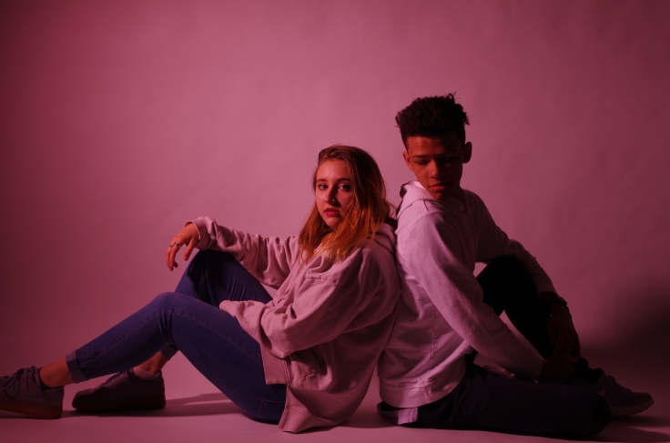
For shoot 3 I wanted to make sure I focused on getting different colours to the ones I had already got from the last 2 shoots but also get some different poses and angles again. I tried to get some oranges, blue, grey and once I had achieved some good photographs with those combinations and tried different poses I then got some more pinks and purples, so I still had plenty of options to choose from. I think that shoot 3 was the best because it achieved everything I wanted, and the photographs turned out really well, although some of them were a little too dark in areas, but overall, I was very pleased and think that I managed to focus on the important areas to get the results I wanted.
From all of the photoshoots I had taken shoot 3 was my best, because of the variety of different shots I achieved, and you can see that I improved. But my favourite shoot was shoot 1 because I really liked some of imagery that I captured and felt as though some of them had feelings and you could tell that from the shot I had taken. But all of my shoots still turned out really well and gave me plenty of options to choose from.
Once I had collected all of the imagery that I wanted I then decided to ask people what photographs they liked best. I mainly asked teenagers because that was my target audience for my magazine, so I valued their opinion more than anyone else’s. I wanted to ask people who I was targeting because I wanted it to appeal to them and make them want to read it, therefore I asked for their opinion. When I was happy that I had collected enough results to make a good, informed decision, on which photographs I should and shouldn’t use, I then went on to make my magazine.
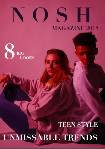
When it came to designing my magazine I wanted to place all of the imagery first so that I could work out where everything was going before writing all of the text and things like that. I took into consideration what other people thought but what I thought looked best for the magazine. I knew what I wanted for my front cover and the taglines I would use alongside the font. I thought that the font looked best for the style I was going for and suited the imagery too. It was simple but still looked good and caught people’s attention. To see where the text boxes would go, I used the guidelines and just filled it with placement text until I was ready to actually type up. I think this was the best way of knowing where everything would go and be able to place everything. It was a long process, however I wanted to make sure everything was to the best standard that I could possibly do.
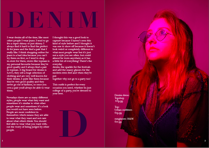
I had placed all of the imagery which took me a few days because some of the photographs that I thought looked good actually didn’t when placed in the magazine, so I had to think and find other ones that suited it and still matches everything. I then started to do my text, I wanted to keep it fashion orientated but also add other elements to it, to make it more interesting. I wanted to include a bit for everyone. So, I wrote about confidence, types of outfits and when and where to where them, I also included prices and where to get the clothes from. I just covered a lot of topics that may worry some or all teenagers. One thing I would change about this process is that I would screenshot it and write about it more because I don’t think I have shown much development from me taking the photographs to me putting them in my magazine.
The placing of the imagery and writing my magazine was my favourite part of the project because I got to see how my magazine would develop from nothing to looking like a professional magazine and I enjoyed watching it develop into a final printed magazine. It really enjoyed each process and I couldn’t wait to have my own copy of a magazine that I had completely made myself and watched it turn into something great.
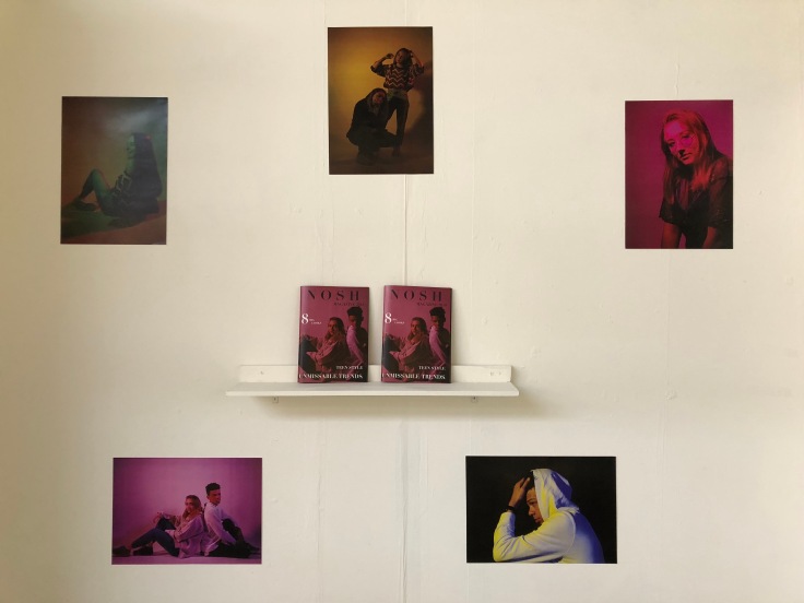
The final part of the project was to print out the magazine and the display it. It took me a while to print out because the bleed and crop marks were wrong, and I was unsure how to change it but really didn’t want to ask for help as I wanted to be able to sort the problem myself, but as the time I had remaining was that long I just decided to get help and the problem was fixed within ten minutes. I then got two copies printed out because I thought it would look better having two on display than just one. I also decided that I would have 5 A3 posters of my models so people could view my photography without any text on it. I think if I had left my self a bit more time towards the end I could have decorated the areas I wat displaying my work in a little more to show off my work more because I don’t want the area that work is in make it look bad or boring. I want to be able to show it off as much as I can.
Overall, I think that my final major project went really well. I enjoyed all of the processes that I had to go through before having the final product ready. I believe that achieved my target of being able to set up the lighting in the studio and working with colour gels. I think that if I were to do anything like this again I would know exactly what I would need to do to be able to either get the same results and outcomes as this time or possibly even better. I thought that I did enough research to be able to make sure my magazine was to a high level and standard. I enjoyed being able to choose what I would do for my FMP and then making that project become a 3D object. I think it made me work harder knowing that I wanted to improve upon something but through something I like and love.
If there was one thing that I could have done better it would have been my time management because I feel like towards the end I was rushing and worrying about getting things done, so my standards may have gone down slightly, which may show up in my work. I should’ve got other people to look through my work before I printed it in case I missed anything that they could’ve potentially spotted and corrected. But other than that, I think that the project went really well, and I am proud of myself for the outcome that I have achieved.


 I thought that the combination above with the picture and the writing looked a little too boring and plain. If I were to use this with my magazine I would have to use a different image or add things to the image like tag lines and things like that to make it a little bit more interesting.
 I like this combination because they both quite interesting and have a lot going on in the images. I think the only thing I would change about this is the guidelines I have used for the first with with the model because it doesn’t quite look right, it just looks wrong. I think even though I used a plain background for the aftershave, it actually blends in quite well and suits the image. I put the images this way round because you pay more for the right side of the magazine as it’s the first page you tend to look at when you flip the page.
 For this combination I was unsure on whether I liked it or not because it looks a little too simple, but then I’m undecided whether that looks good or not, or if I should add some extras to it.
 This is a good match, however I think the page with the model needs more tagline and things like that to add some more detail and make it more like a magazine page.
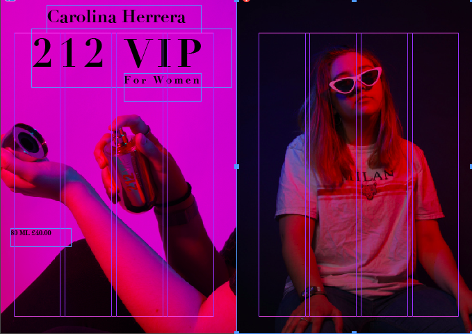 These are too different and bold to be next to each other i should try and find a different combination.
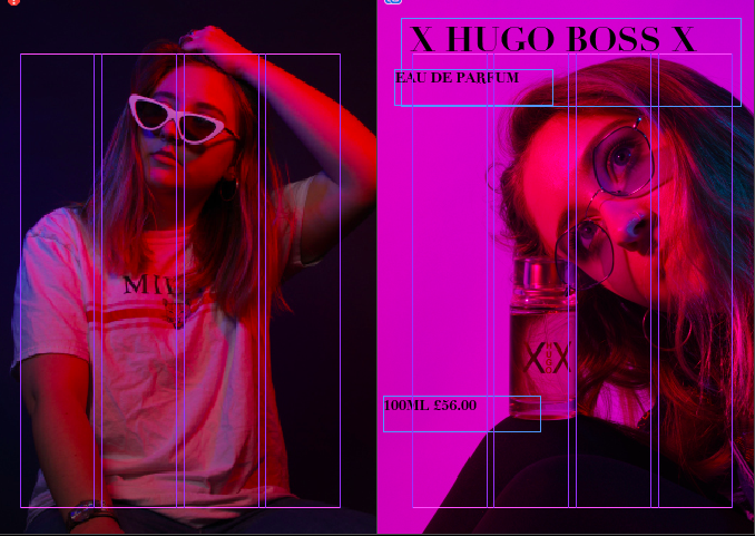 For these pages I think there is too much going on in them, I think I need to make it so that there is either a page for text next to the model instead of a advert of have a simpler image next to the advert because there is too much going on to concentrate.
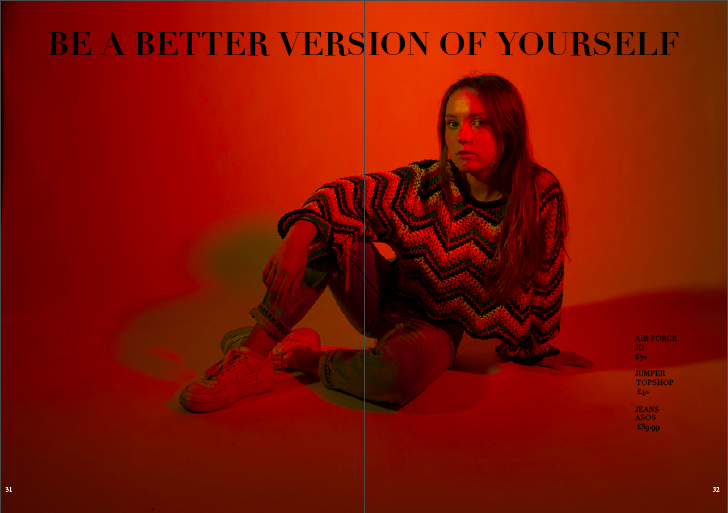
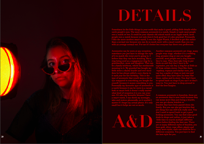 The colours have used for this are all matching which is why I think the pages match each other so well. I also think the photograph adds a little bit of mystery, making these pages more interesting and getting peoples attention.
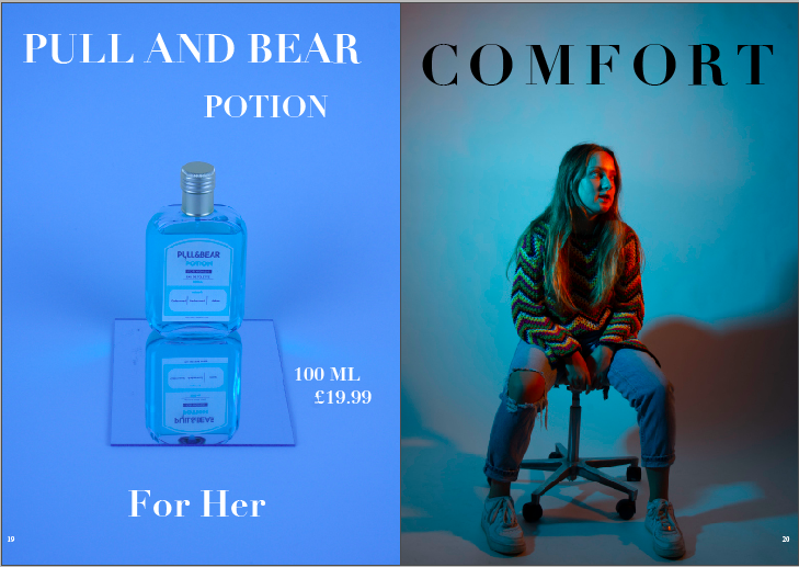
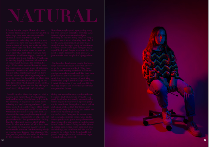
 This was my favourite combination for this advert above because the page next to it is quite interesting and has more colours than just the blue, which makes it that little bit more interesting in my opinion.
 This was one of my favourite pages that I made, I think because they suit each other so perfectly and they blend together so well that it’s makes it really interesting and catches your eyes instantly. I like the placement of every bit of text and think, although I might change the text box and have one square set box instead of two separate ones.
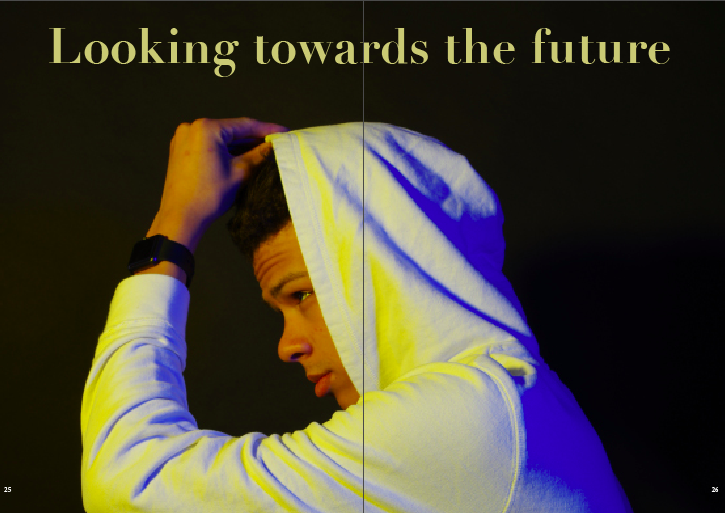
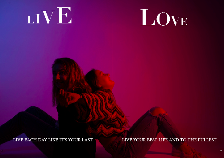
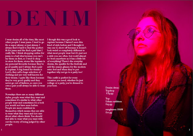 This was another favourite of mine because these are such interesting pages because the colours on the first page match the clothing on the model. Also there isn’t too much going on in either of the pages but they’re still both full of detail which makes these so interesting.


